Sunday, February 16, 2014

More Brown, Brown & Brown!

I really loved the monochromatic coloring of the E Copic shades; however on this one I decided to go with the easy challenge for MiC, as I wanted the background to be in color! This is a new digi stamp for me, Tap dancing-heel click, but one I have been eyeing for a while. The other images I used were also from Make it Crafty, and they were from the Theater Elements Collection.
This time I colored the dancer in the E30 series of Copic markers.
 

 I wanted the sky to look like a storm just had gone through and the buildings to be glowing from the sun's reflection-and also look like a stage background. The sky is BVs, the buildings YR and Y, and the stage floor E70s.
 I cropped the two background images and grouped them in Word. Then I made the dancer--I'll call him Fred- I made Fred the size I wanted to fit onto my standard-sized card, just large enough so his hat would be a little bit off the top of the background. I tried to leave a white outline when cutting him out, and popped him up with foam dots to make him stand out a little more!
 For the sky, I tried spritzing it with champagne-colored spritzer, but it was somewhat clogged and did not spray too well at first...you'll see. I like the overall effect it had on the card though!
 
  I tried to just get it on the sky and buildings, not the stage; and here's a pic of the background image before Fred danced onto it!
 

 This was also a fun one to color up, thanks for looking!

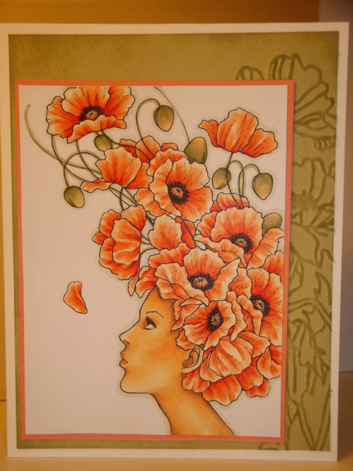
Poppies-What is your favorite flower?

That is the question for this month's image theme from the fabulous Mitzi Sato-Wiuff! This challenge can be found on her Facebook page: Stamps by Auora Wings.  I had a lot of fun coloring up this image, and I hope it makes you smile too! I can just imagine her "pffft" to blow the flower petal up into the air =]
.
 
 
If I made this into a bigger card than a 5 1/2 x 4 1/4 it would have had more room for my background embossed paper image and more embellishments, but I really like being able to just pop it into an invitation envelope and send it out...I think the idea is still conveyed..


Here's more of a close up. The Copic colors I used were (from memory) R05, YR02, YR01, YR00, E50, E51, E53, E54, W5, W3, YG 91, YG 95, BG90.
This image is called Poppies and you can get it as a digital download from her shop on ETSY,  AuoraWings.

Tuesday, February 11, 2014

Happy Valentines 2014!


Here's my card for the latest Kenny K Challenge; anything goes with a twist of love! Just look at those two lovebirds =]  (Thanks Kenny K for the awesome January Freebie!)I am also entering it into the Oozak Challenge; white with one color.
 
The Copic marker color family used was R80s, with a little RV 10 for their blushing cheeks. I also used some white, semi-transparent glitter on the hearts to bling it up a little.
 
Thanks for looking and Happy Valentines Day to you all!

Sunday, February 9, 2014

MiC Challenge #6 Brown, Brown & Brown

I am loving all the inspiration I see on the Make It Crafty/Colorful challenges! This month I decided to try my hand at it.
Last week, I was also a very lucky recipient of the new digi release of Carefree women collection. It is awesome!
It's perfect for those cards that need a "more-adult looking" image. Some of the images come with patterned clothes, and also a separate image without the patterns-perfect to paper piece or draw your own pattern on!
I decided to go all in and try the hard challenge, making my card look like an old-fashioned sepia picture. 


Sorry the photos are blue!! I used daylight through a window and a white paper behind the image, but my camera did not do good on the white balance. The two pics I have that do not look blue were taken with a different camera. They are a little lighter than the actual card is colored. I am not able to get a "whiter" picture of the background image by itself since the card was put together by the time I discovered this mistake....
 
I used Copic Markers in the E-shades of which I have the most: E40, 42, 43, 44,47 and 49.
I imagined Carefree Elise to be on a fabby vacation and her friend snapped a pic in front of this castle, which is another MiC image, Far away castle. (First time coloring both images!)
Here is a pic of the background after it was colored.
I wanted the sky to not be a block of color, so I variegated the browns and tried out a burlap/alcohol technique I learned from passionatepapercreations -Rhea Wiegand. This part of the image was colored first =] Then it was trial and error, starting a little lighter and adding darker colors to bring out more depth.
 
 
I popped up Elise with foam dots to make her really stand out with all that brown...
Thanks for looking at my creation. It really was a lot of fun to try this challenge! You have the whole month, if you'd like to join up too!