Monday, June 23, 2014

What goes up and never comes down?....

Hmmm....


YOUR AGE!!!  Say What!!
 
 
These sassy cuties are from Little Miss Muffet Stamps and can be found here: Jr-Hatter-Michelle and
Jr-Hatter-Kathrina.  The sentiment is from create with TLC. This image is colored with Copic markers; and has some enamel dots, purchased from Oozak.
  I merged the two junior hatters and the words in my Microsoft Word program and colored up these two jokers with the My Favorite Things Color Palate Challenge 6 and the LMMS Challenge 88 anything goes challenges in mind.
 I hope you like my little funny and thanks for checking out my blog!

Thursday, June 12, 2014

Happy Birthday! Marilyn Style

Well, sortof...I have a Marilyn anyway!! She's from Kraftin' Kimmie Stamps and is a rubbah image with a sentiment. The happy birthday sentiment circle is one I have had for ages. It has been unmounted and I am no longer sure which company it is from, maybe a PSX??
 
I wanted this card to be pretty much white-on-white. I deviated by adding a little blue-for her eyes, the happy birthday sentiment and the background card base.
The chandelier is cut from a shimmer paper with my Cricut and a cartridge from CTMH. Rhinestones were added to give a little more bling for Marilyn. In the photo above you can kind of see the sentiment....
The background was embossed with a folder from SU! The stairs were also embossed from a SU! folder, and the die is from Memory Box.   This was kind of a busy card for me. I was not sure about it at first, but it is slowly growing on me!             Here's the full card front:
 
The fancy double scallop border at the bottom is also from shimmer paper and the die is from MFT. Marilyn is colored with Copics and clear glitter is added to her dress and shoes for added Pizzazz!
 

(SU!=Stampin' Up!  CTMH=Close To My Heart  MFT=My Favorite Things.)
Thanks for checking my blog out and I hope your weekend is full of sparkles!!


Wednesday, June 4, 2014

My Dad's Truck

This is the perfect digi, for the perfect card, for my dad on this Father's Day!
Thanks Tiddly Inks! I would love to enter it into your contest!!
  The card was made with Stampin' Up! cardstock and Cordinations cardstock, which I sanded for the banner. -I didn't plan on watercoloring the image, so it is printed on Georgia Pacific CS. Watercoloring seemed the best way for me to get that old, rusty-truck look! The enamel dots are "Happenings" from My Minds Eye, purchased at Oozak.com.
 
 
Thanks for looking and I hope you are inspired to try watercoloring!

Tuesday, May 27, 2014

Just saying Hello

This fun little card was made with Little Miss Muffet Stamps: Polka Dot Pals Narah digi image. This was the first time for me coloring her up, and I was a little apprehensive about trying to draw my own nose and mouth.. Anyway, I think she's still pretty cute this way! This image is merged with Make It Crafty: Pebblestone patch digi stamp.
The crystal-sparkling sequins just arrived to my door from Some Odd Girl: Spring Fling. I literally sprinkled them onto the card then glued them where they fell :) .  The embossed clouds on the yellow paper-ribbon-tag is from a Stampin' Up! embossing folder. I used the debossed side and did not emboss the bottom of the tag.
 
Here's a different angle to show of the sparkle in the sequins!

 
Copic colors for this card include: E04, E11, E21, E00, E000, R11. B32, B34, B37. G99, YG67, YG23. Y38, Y11, Y15, Y17. E37, E33, E30.BG05, BG01. E77, E74, E71, YG00.RV10, RV21, RV23.
I am entering this card into LMMS challenge LMMS Challenge 86: Anything Goes. Thanks for looking and hopefully I have inspired you to get crafty!

Saturday, May 24, 2014

Chillin with aqua accents!

This week I am entering into two challenges. The first is the new Headshot release from Simply Betty Stamps. The second challenge is a layout from MFT; one of my newest favorite shops! The Gerbera Daisy Die is also from MFT.  Ice Queen Betty (SBS) is colored up with cool colors, glitter and sparkles.
 
The teal blue foil paper came with the ridges and was cut with the metal die mentioned above. One is popped up for added dimension. The sentiment, I believe from a Stamping Up! set is stamped in variegated pink-purple/blue metallic ink. White SF Sharpie Pen accents were added to her hair, but then I thought it made the artist's drawn lines look like dotted lines, so this gave me the perfect reason to add more Stickles sparkle to her hair. Stickles were also added to the collar of her dress and her necklace. She has clear Spica glitter pen added to her eyelids and a touch to her lips also. Here are some close-up shots:

Here's a second card for comparison I made for my stash, and I did not add the extra sparkles to her hair. (It was fun to challenge myself to try to make icy colors in pastel form! ; ] ).  I used Copics on all.

The  second part of SBS challenge was to use the headshot of Music Notes Rio. This time the challenge was to use black and white plus one other color of choice. (From the samples it looked like it was okay to color the skin natural colors.) Here's my take:
I decided to stick with the same aqua-teal color I love for this one. I am still struggling practicing with black hair! The black colors were made with cool grays and BVs for the shirt and eyes. BGs were used for the pops of color. I tried to make the music notes look like they had a glowing, vibrant center. I also die cut the double background from a shape set, and the fancy flourish is from Lawn Fawn. The music note inked background is from a stamping wheel from Stamping Up!, and for an extra accent of color, I added some enamel dots.  
Thanks for checking out my site!


Tuesday, May 13, 2014

Cupcakes with Jean

The image for this card comes from the amazing MayzyArt Site! She has so many images, and after some time away, she is cranking out even more awesome images! This one is called Jean and she's bringing a treat for you.
The layout is one from Jen's Deconstructed Sketches (150), and I changed it up just a tad!
 
She's colored up in Copics, and I didn't write the combo down this time, but there are BGs and cool greys, possibly E15, a YR and Y for the hair...I used Spica turquoise glitter pen for her barrettes, the bling on her belt and buttons on her boots. The blue background is also a shiny/glittery paper from a pack in my stash. I think it totally makes this card!
 
I changed the ribbon in the middle (from the sketch) to be this fun twisty-cut piece of textured paper and was having a time trying to think of what I should use in the corner, when it dawned on me- I have a Sizzix die for a cupcake (It also has an icecream cone with it and is an oldie.)! I bent the edges of the cupcake paper for a more 3-D look and the frosting was embossed with a stencil using a thin rubber mat through my Big Shot. The cupcake is popped up for added dimension.
Thanks for looking! (Dontcha just want a cupcake now?)


Tuesday, April 22, 2014

Hannah Hearts-Kraftin' Kimmie weekly challenge

This is the outcome of the live color-a-long done with Alyce from Kit and Clowder-ning community. She has classes we can take and does some live work we can join in on too! This image was her class a few weeks ago, and I've made it into a card I would like to enter into the Wednesday -anything goes- challenge on the Kraftin' Kimmie Challenge Blog.
Hannah Hearts is a rubber image that can be purchased from Kimmie here.
The Wednesday Challenge can be found here.
 
Thanks for looking and check out both all the activities going on, on the Kit and Clowder site and all the sweet rubbah goodies and more from Kraftin' Kimmie!

Sunday, April 20, 2014

Thanks Mom...

Here's a super-cute digi image from CC Designs, helping me get a jump on a couple Mother's Day cards; a Mashi's Muffins Mom.
The paper is from Colorbok-Homespun, with Stampin Up! Very Vanilla CS for the main body of the card. The doily is from Shapeabilities Moroccan Motifs, and the glittery paper I used with the die is from the DCWV-Linen Closet Pad. Unfortunately the picture did not pick up the sparkle on this or the bluish stripe paper too well.
The image was colored with Copics.  In real life,      ;o]       her shirt matches the blue on the background papers much better!
 
Since I was having layout block, I was excited to have found this awesome layout template! Every week MFT has a new one!    AWESOME!!    I used my take of this week's sketch (172) from My Favorite Things and I think it made everything tie together perfectly!
Copic Marker colors: Skin: E000, E00, E04, E11, E21, R20. Shirt: BG78, BG75, BG34. Apron: R35, R37, W3; G0000, G00, BG34. Hair: E47, E37, E33, E31. Eyes: B97, B32, 110, Sharpie Xtra-fine white paint marker.
Thanks for checking out my card!

Sunday, March 23, 2014

Unicorns and Rainbows

Here's a fun card I made with an older Whimsy Stamps image by Crissy Armstrong called Mystic.

   The image was colored with Copics: V09, V17, V15, V12; B05, B02, B00; YG63, G16, G20; Y17, Y15, Y11; YR07, YR02, YR00; R27, R22, R21. The feet were colored with the lighter shades: B00, BOOOO, V12, Y11, YR00, G20, and W00 blending out and through all of those. For body shading: W3, W1, W00. Hooves and horn: Y28, YR20.
   The background paper was a piece from my stash and I marked where the rainbow would hit the clouds and cut that area with an Exacto-knife so the rainbow could slide behind the clouds. The grass is die cut from two different greens. The lighter green in the background is glued down completely while the darker foreground green is only glued at the bottom and ends. The unicorn is placed into the grass and the front legs and head are popped up with dots while the rest is glued down for even more dimension.
   The rainbow was made with 7 nesting circle dies; each one progressively smaller. I started with the largest circle die and cut a red circle. Using the 1st smaller circle, I cut and orange circle. Still on the orange paper, I placed the 2nd smaller die so it would have an even border of orange around the outside and cut it. So now it is an orange ring. Now using the same 2nd smaller die I cut a circle of yellow paper and then cut it into a ring using the 3rd smaller die. I repeated this procedure all throughout the colors until I got to the inside purple circle, cut with the 6th smaller circle die.
   Next I started gluing the rings onto the red circle starting with the largest ring-orange; trying to keep an even margin of red on the outside. Then the yellow ring fit right inside the orange (the inside of the yellow ring is cut with the outside of the yellow ring for a perfect fit). Continue this way until the purple circle is glued in the center. Then I took the rainbow circle to the die cutter again and cut out the 7th smaller (the smallest one in my series) circle in the center of the purple to make it a ring. This could actually be done before when cutting out all the pieces, but I was not quite sure how it would come together, but I think it would be fine either way. The very last step was to cut the rainbow circle in half, ending up with two perfect rainbows!
   Here is a close up of the image.
Thanks for sticking with me through this long post! If you need a rainbow, I hope you try this out; it really is not that hard and was fun to do!!
    I am entering it into the Kit and Clowder Whimsy Release Party Event.

Saturday, March 15, 2014

Snapdragon Sprite and friend

I could resist this little cutie no longer! You can find her at Sweet Pea Stamps here as a rubber stamp, just scroll down a little; or Aurora Wings, Fantasy Art of Mitzi Sato-Wiuff, as a digital stamp. (On ETSY)  She was a lot of fun to color up and I kept the card pretty CAS-clean and simple, letting the image shine!
 
The background embossing folder is a fun one by Sizzix, through Stampin'Up! and is called elegant lines. Here are a couple more views of the card...
 
Thanks for viewing and I hope you enjoyed! I would like to enter this into the   One Sweet Challenge for March by Sweet Pea Stamps, and into Mitzi's Facebook challenge, Shades of Green. 

Wings and a little Green...with Druscilla

Have you been to Alyce's Kit an Clowder -ning page to check out all the activity yet? Her last live color-a-long featured coloring pleats with a Tiddly Inks image. It was a fun learning experience. This month her challenge is: Wings! So, I'd like to enter this other TI image into her contest. This image is colored up real similar to her coloring demonstration. Alyce is offering some cool classes too, so head on over to her page and check it out! http://kitandclowder.ning.com/  
  This fabby image I've colored up with my Copics can be found here at the Tiddly Inks shoppe!
The left side of the image is highlighted in pale yellow. It didn't show up in the photos too well, but here is a close up of the yellow highlights colored into the image...
I'm also entering this card into the Sassy Studio Designs Anything Goes Challenge with Green or St Paddy's Day. This is another fabulous shop with awesome images, but I'll get my feet wet with this TI image for their challenge. (DTBST #220)
Thanks for looking and I hope you got some inspiration!

Sunday, February 16, 2014

More Brown, Brown & Brown!

I really loved the monochromatic coloring of the E Copic shades; however on this one I decided to go with the easy challenge for MiC, as I wanted the background to be in color! This is a new digi stamp for me, Tap dancing-heel click, but one I have been eyeing for a while. The other images I used were also from Make it Crafty, and they were from the Theater Elements Collection.
This time I colored the dancer in the E30 series of Copic markers.
 

 I wanted the sky to look like a storm just had gone through and the buildings to be glowing from the sun's reflection-and also look like a stage background. The sky is BVs, the buildings YR and Y, and the stage floor E70s.
 I cropped the two background images and grouped them in Word. Then I made the dancer--I'll call him Fred- I made Fred the size I wanted to fit onto my standard-sized card, just large enough so his hat would be a little bit off the top of the background. I tried to leave a white outline when cutting him out, and popped him up with foam dots to make him stand out a little more!
 For the sky, I tried spritzing it with champagne-colored spritzer, but it was somewhat clogged and did not spray too well at first...you'll see. I like the overall effect it had on the card though!
 
  I tried to just get it on the sky and buildings, not the stage; and here's a pic of the background image before Fred danced onto it!
 

 This was also a fun one to color up, thanks for looking!

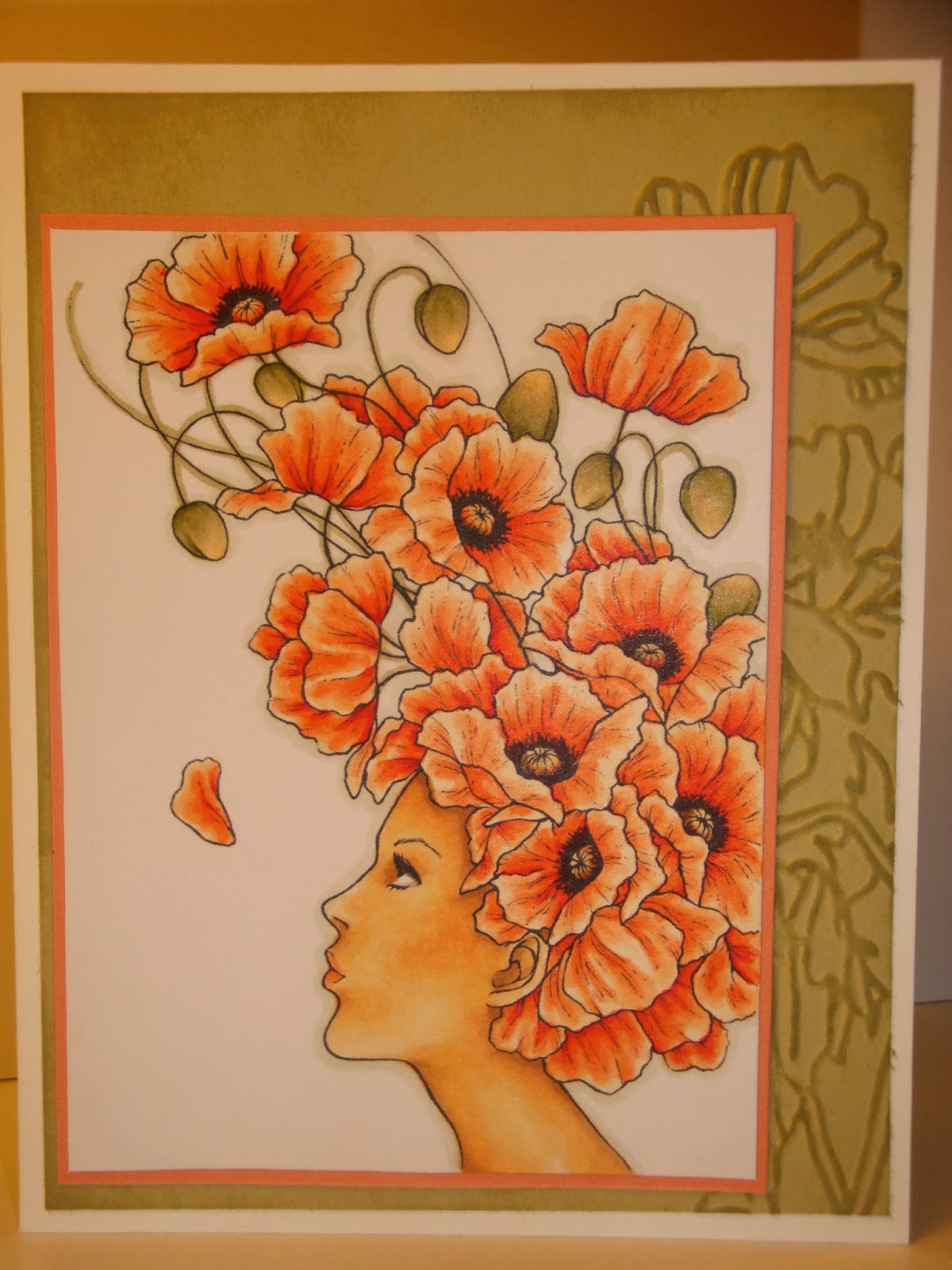
Poppies-What is your favorite flower?

That is the question for this month's image theme from the fabulous Mitzi Sato-Wiuff! This challenge can be found on her Facebook page: Stamps by Auora Wings.  I had a lot of fun coloring up this image, and I hope it makes you smile too! I can just imagine her "pffft" to blow the flower petal up into the air =]
.
 
 
If I made this into a bigger card than a 5 1/2 x 4 1/4 it would have had more room for my background embossed paper image and more embellishments, but I really like being able to just pop it into an invitation envelope and send it out...I think the idea is still conveyed..


Here's more of a close up. The Copic colors I used were (from memory) R05, YR02, YR01, YR00, E50, E51, E53, E54, W5, W3, YG 91, YG 95, BG90.
This image is called Poppies and you can get it as a digital download from her shop on ETSY,  AuoraWings.

Tuesday, February 11, 2014

Happy Valentines 2014!


Here's my card for the latest Kenny K Challenge; anything goes with a twist of love! Just look at those two lovebirds =]  (Thanks Kenny K for the awesome January Freebie!)I am also entering it into the Oozak Challenge; white with one color.
 
The Copic marker color family used was R80s, with a little RV 10 for their blushing cheeks. I also used some white, semi-transparent glitter on the hearts to bling it up a little.
 
Thanks for looking and Happy Valentines Day to you all!

Sunday, February 9, 2014

MiC Challenge #6 Brown, Brown & Brown

I am loving all the inspiration I see on the Make It Crafty/Colorful challenges! This month I decided to try my hand at it.
Last week, I was also a very lucky recipient of the new digi release of Carefree women collection. It is awesome!
It's perfect for those cards that need a "more-adult looking" image. Some of the images come with patterned clothes, and also a separate image without the patterns-perfect to paper piece or draw your own pattern on!
I decided to go all in and try the hard challenge, making my card look like an old-fashioned sepia picture. 


Sorry the photos are blue!! I used daylight through a window and a white paper behind the image, but my camera did not do good on the white balance. The two pics I have that do not look blue were taken with a different camera. They are a little lighter than the actual card is colored. I am not able to get a "whiter" picture of the background image by itself since the card was put together by the time I discovered this mistake....
 
I used Copic Markers in the E-shades of which I have the most: E40, 42, 43, 44,47 and 49.
I imagined Carefree Elise to be on a fabby vacation and her friend snapped a pic in front of this castle, which is another MiC image, Far away castle. (First time coloring both images!)
Here is a pic of the background after it was colored.
I wanted the sky to not be a block of color, so I variegated the browns and tried out a burlap/alcohol technique I learned from passionatepapercreations -Rhea Wiegand. This part of the image was colored first =] Then it was trial and error, starting a little lighter and adding darker colors to bring out more depth.
 
 
I popped up Elise with foam dots to make her really stand out with all that brown...
Thanks for looking at my creation. It really was a lot of fun to try this challenge! You have the whole month, if you'd like to join up too!